Main Results
A design matrix was formed giving each replicate it’s own baseline and the common DHT response was then specified as the final column. Following this, dispersions were estimated for the main DGEList object and the model fitted using the Quasi-likelihood GLM.
X <- model.matrix(~0 + rep + treat, data = dge$samples) %>%
  set_colnames(str_remove(colnames(.), "treat"))
dge <- estimateDisp(dge, design = X, robust = TRUE)
fit <- glmQLFit(dge)
alpha <- 0.05
lambda <- log2(1.2)
topTable <- glmTreat(fit, coef = "DHT", lfc = lambda) %>%
topTags(n = Inf) %>%
.[["table"]] %>%
as_tibble() %>%
mutate(
location = paste0(seqnames, ":", start, "-", end, ":", strand),
rankingStat = -sign(logFC)*log10(PValue),
signedRank = rank(rankingStat),
DE = FDR < alpha
) %>%
dplyr::select(
gene_id, gene_name, logCPM, logFC, PValue, FDR,
location, gene_biotype, entrezid, ave_tx_len, gc_content,
rankingStat, signedRank, DE
)
de <- dplyr::filter(topTable, DE)$gene_id
up <- dplyr::filter(topTable, DE, logFC > 0)$gene_id
down <- dplyr::filter(topTable, DE, logFC < 0)$gene_idIn order to detect genes which respond to DHT the Null Hypothesis (\(H_0\)) was specified to be a range around zero, instead of the conventional point-value.
\[ H_0: -\lambda \leq \mu \leq \lambda \\ \text{Vs.} \\ H_A: |\mu| > \lambda \]
This characterises \(H_0\) as being a range instead of being the singularity 0, with \(\mu\) representing the true mean logFC. The default value of \(\lambda = \log_2 1.2 = 0.263\) was chosen. This removes any requirement for post hoc filtering based on logFC. Using this approach, 856 genes were considered as DE to an FDR of 0.05. Of these, 384 were up-regulated with the remaining 472 being down-regulated.
topTable %>%
  ggplot(aes(logCPM, logFC)) +
  geom_point(
    aes(colour = DE),
    alpha = 0.5
  ) +
  geom_text_repel(
    aes(label = gene_name, colour = DE),
    data = . %>%
      dplyr::filter(logFC > 1.7 | logFC < -1.5),
    show.legend = FALSE
  ) +
  geom_smooth(se = FALSE) +
  scale_y_continuous(breaks = seq(-8, 8, by = 2)) +
  scale_colour_manual(
    values = c("grey50", "red")
  ) +
  theme(
    legend.position = "none"
  )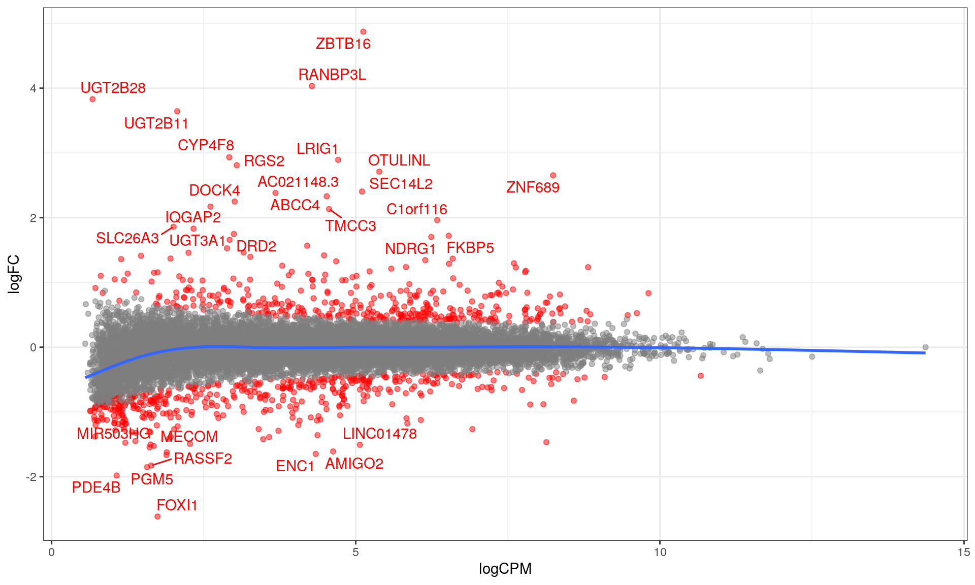
MA plot with blue curve through the data showing the GAM fit. The curve for low-expressed genes indicated a potential bias remains in the data, whilst this is not evident for highly expressed genes. DE genes are highlighted in red.
ggsave(
  here::here("docs/assets/plotMA.pdf"),
  width = 10, height = 6,
  units = "in"
)
topTable %>%
ggplot(aes(logFC, -log10(PValue))) +
geom_point(
aes(colour = DE),
alpha = 0.5
) +
geom_text_repel(
aes(label = gene_name, colour = DE),
data = . %>%
dplyr::filter(abs(logFC) > 1.7 | PValue < 5e-13),
show.legend = FALSE
) +
geom_vline(xintercept = c(-1,1), colour = "blue", linetype = 2) +
labs(
y = expression(paste(-log[10], "p"))
) +
scale_x_continuous(breaks = seq(-8, 8, by = 2)) +
scale_colour_manual(
values = c("grey50", "red")
) +
theme(
legend.position = "none"
)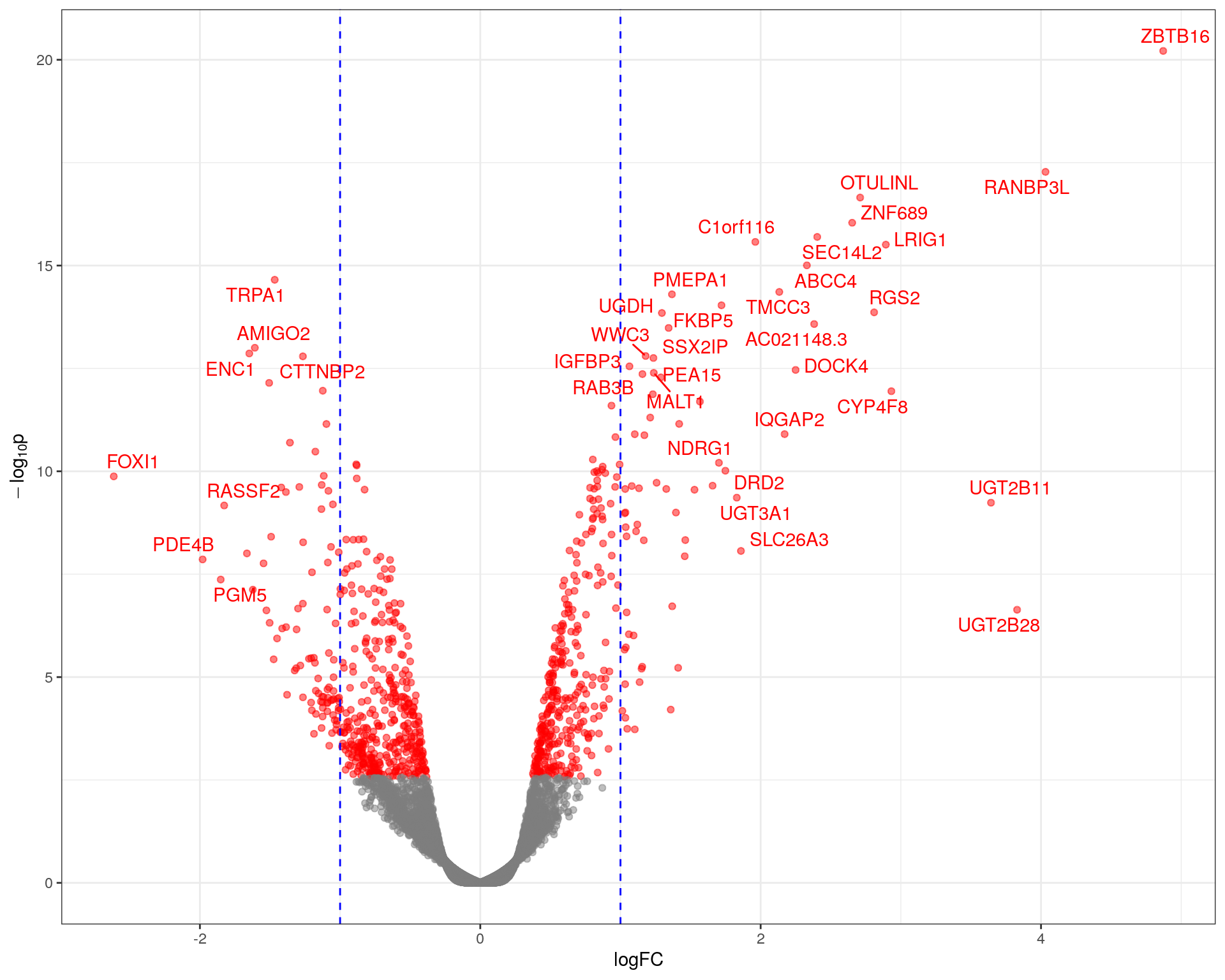
Volcano plot showing significance against log fold-change. The common-use cutoff values for considering a gene as DE (|logFC| > 1) are shown in blue as a guide only as these were not used for this analysis.
ggsave(
  here::here("docs/assets/plotVolcano.pdf"),
  width = 10, height = 8,
  units = "in"
)
topTable %>%
dplyr::filter(DE) %>%
dplyr::select(-DE, -gc_content, -ave_tx_len, -contains("rank")) %>%
mutate(
across(c("logFC", "logCPM"), round, digits = 2)
) %>%
datatable(
rownames = FALSE,
caption = glue("*All genes were considered as DE using the criteria of an FDR-adjusted p-value < {alpha}.*")
) %>%
formatSignif(
columns = c("PValue", "FDR"),
digits = 3
)Top DE Genes
logCPM values for the most up and down-regulated genes were also inspected using simple boxplots.
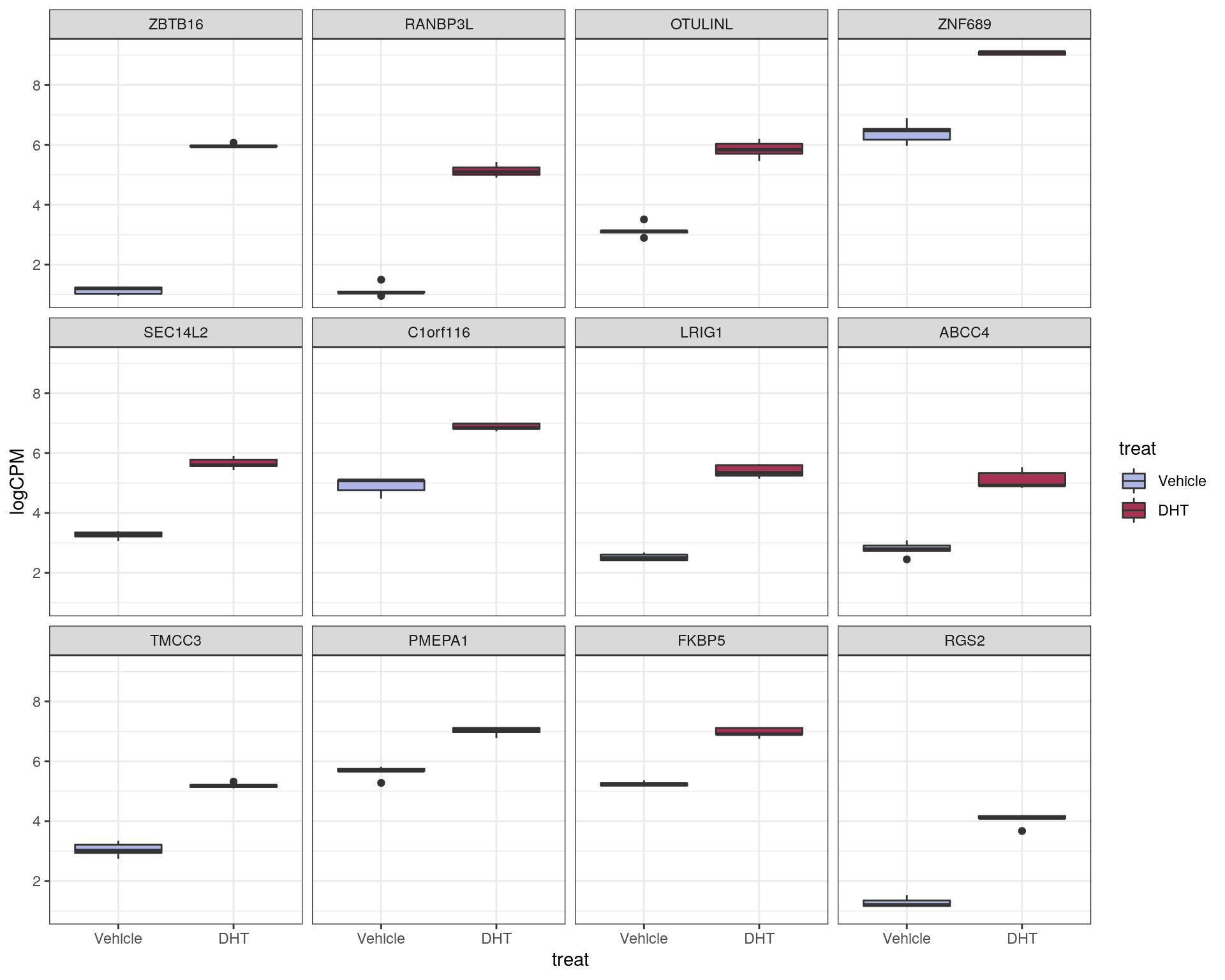
Top ranked up-regulated genes
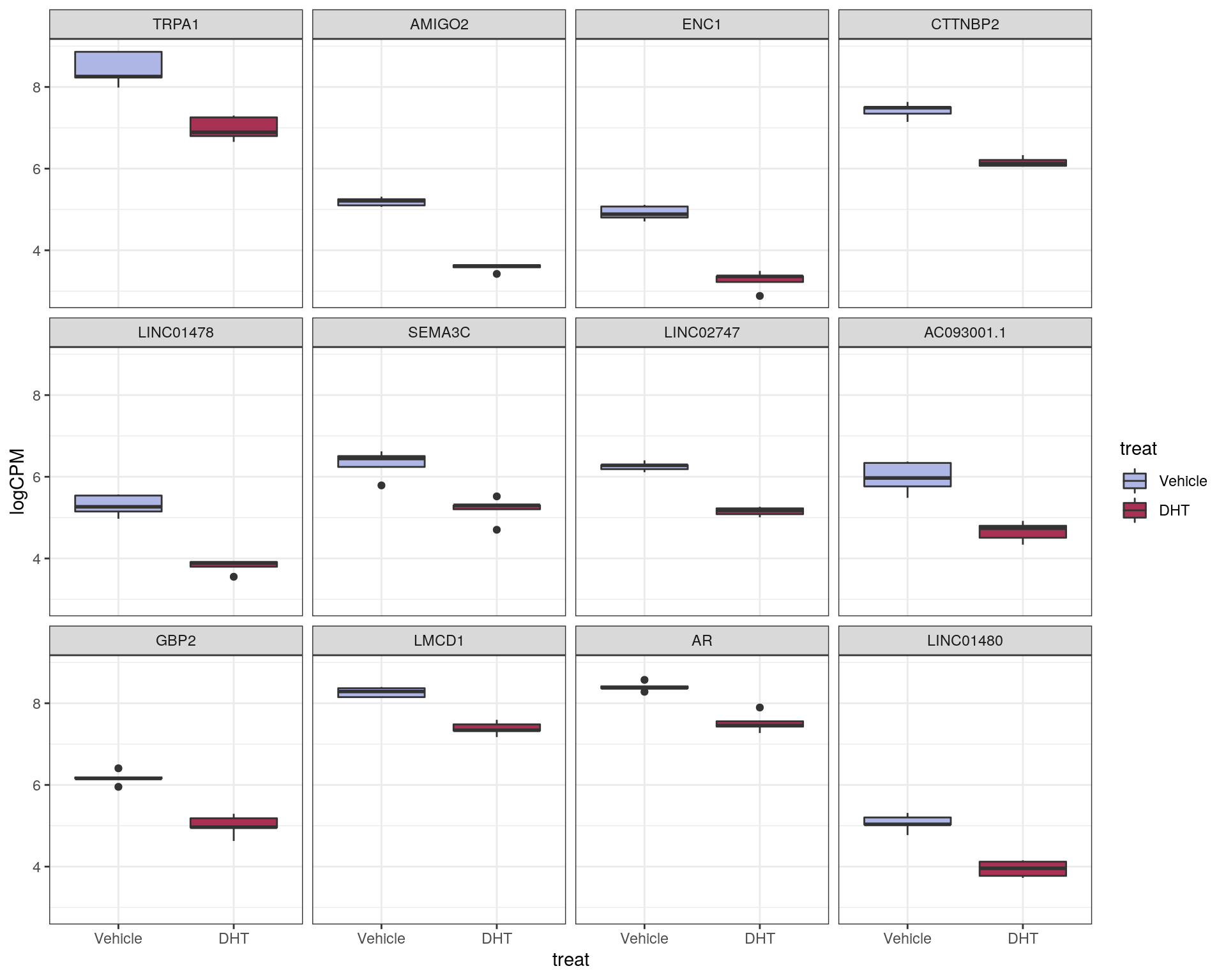
Top ranked down-regulated genes